When opening your company's homepage on a smartphone, photos appear sluggishly from top to bottom. While it wasn't noticeable on the office network, you are noticeably kept waiting when out on the go. Running performance measurement tools revealed that images accounted for nearly 90% of the page's total payload.
In such situations, consulting a production agency usually brings back the response: "Let's switch to WebP." This is largely the correct answer. However, moving into 2026, the landscape of image formats has shifted slightly. With more factors to consider, jumping straight into format debates while skipping more effective preliminary steps has also become more common.
Before changing formats, there is usually another cause
When actually opening and inspecting sites burdened with heavy images, the most common issue is not the format. It is cases where original images 4,000 pixels wide are embedded directly and scaled down on the display side.
Sending a 4,000-pixel image for a photo displayed at 400 pixels wide on a smartphone screen: in this state, changing to any format will yield limited results. Reducing the volume of data sent in the first place is orders of magnitude more effective.
- Export matched to display dimensions. Roughly twice the display width is sufficient even for high-resolution displays
- Load off-screen images later. Simply adding
loading="lazy"reduces the initial payload - Delete images that are fundamentally unneeded. Removing large decorative background photos is the most reliable way to speed up a site
After clearing these items, if the site is still slow, that is when formats come into play. The overall mindset for lightening page loads is also discussed in Unnecessary JavaScript and site speed.
The three formats have different strengths
In practice, there are three formats usable for displaying photos.
| Format | Browser support | Strengths | Practical role |
|---|---|---|---|
| WebP | Virtually all browsers | General photos and illustrations | The default choice when in doubt |
| AVIF | Available in major browsers | Photos, especially large ones | Focus on compression ratio; export is intensive |
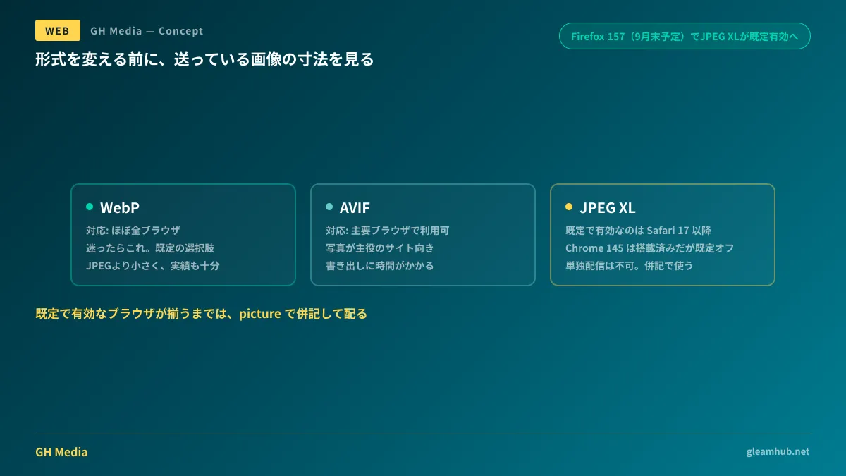
| JPEG XL | Enabled by default only in Safari | Photos, recompressing existing JPEGs | Cannot be used alone; use with fallbacks |
WebP has widespread support and produces smaller files than JPEG for equivalent visual quality. Currently, it is the format where "you won't go wrong sticking with just this."
AVIF can achieve even smaller sizes at equivalent image quality. The difference is particularly pronounced with large photos. On the other hand, exporting takes time, and converting may not be practical depending on your CMS or build environment. It is worth considering for image-centric sites (accommodations, dining, e-commerce).
While JPEG XL is considered the most promising in terms of compression performance, it cannot serve as your primary delivery format as of August 2026. The reasons are as follows:
JPEG XL is not yet consistently "enabled by default"
Having once been removed from Chrome, tracking subsequent movements around JPEG XL has become confusing. As of August 2026, the situation can be summarized as follows:
- Safari — Display is supported by default starting in Safari 17 (2023). However, animation and progressive rendering are not supported
- Chrome — In January 2026, the Rust-based jxl-rs decoder was integrated into Chromium and included in Chrome 145. However, it is disabled by default and must be enabled via
chrome://flags. - Firefox — Mozilla announced plans to make it enabled by default across all platforms in Firefox 157. Firefox 157 is scheduled for release in late September.
In other words, even after Firefox 157 is released, Chrome, which holds a major market share, will remain disabled by default. If you deliver images using only JPEG XL, users on Chrome will not be able to view them.
What is crucial to understand here is that it is simply "still early," not "unusable." As long as you provide a fallback, there is no downside to introducing it today. Supported browsers will receive lighter images, while unsupported browsers will receive conventional images.
You only need to learn one fallback syntax
To specify multiple formats together, use <picture>. The browser checks them from top to bottom and picks the first format it can display.
<picture>
  <source srcset="/images/hero.jxl" type="image/jxl">
  <source srcset="/images/hero.avif" type="image/avif">
  <source srcset="/images/hero.webp" type="image/webp">
  <img src="/images/hero.jpg" alt="工場の外観" width="1200" height="800" loading="lazy">
</picture>
The final <img> serves as a catch-all if none of the <source> entries match, and this is where you specify alt text and image dimensions. Including width and height prevents layout shifts while loading.
Note that this syntax means preparing as many files of the same image as there are formats. Attempting to handle this manually will inevitably fail, so make sure to rely either on automated CMS conversion or build-time generation. If workflows rely on manually creating and embedding three variations, everyone will stop doing it after three months.
Key inspection points for procurement and acceptance testing
When commissioning a website build or redesign, the client should verify the following three points rather than focusing on format names.
- Is image export automated or manual? Make sure the workflow does not require staff to manually export three formats every time an article is published. If it is not automated, bloated images will inevitably start slipping in with every update.
- Are fallbacks included? If newer formats are used, are they coupled with
<picture>fallbacks? Specifying them in isolation will prevent some users from seeing the images. - Do the display dimensions match the image dimensions? Inspecting an image with browser developer tools reveals both the actual file dimensions and the rendered display dimensions. If these diverge significantly, you have an issue that precedes file formats.
You can easily verify the third point on your own even after delivery. This check is not about doubting your development agency, but about ensuring the site will not slow down as updates continue. For non-photographic graphics like diagrams and icons, receiving them as text-editable SVGs rather than these three raster formats offers distinct advantages in both file size and ease of updates. Many sites become sluggish once ongoing image replacements begin, and the culprit is usually operational workflow, not the file formats themselves.
What to do next
First, select the heaviest page on your website and check the total size of its images. Filtering for images in the Network tab of your browser's developer tools takes only a few minutes. If it exceeds 2 MB, there is immediate room for reduction.
Next, check with your agency whether image exports are automated. If they are automated, adding JPEG XL support down the road will only take a single configuration change. If not, fixing that workflow will be far more effective than adding new formats.
GleamHub offers website development and redesign consultations to help with site speed optimization, image delivery architecture, and post-redesign operational workflows. Because feasible measures depend on your current infrastructure and update workflows, please reach out individually. Contact us via our inquiry form.
Sources
- Mozilla Presents Their Plan For Shipping JPEG-XL In Firefox 157 — Phoronix
- Intent to ship: JPEG XL — mozilla.dev.platform
- Google rekindles relationship with jilted JPEG XL image format — The Register
- WebP image format — Can I use
- AVIF image format — Can I use
<picture>: The Picture element — MDN Web Docs