
"We just want to update the copy on that diagonally cut section on the home page"—have you ever had such a request return with an estimate of tens of thousands of yen? The reason is that the section was built as a single image rather than live text. Modifying text requires regenerating the image, and doing so leaves you no choice but to hire the agency holding the source design files.
The exact same issue occurs with notched cards, wavy section dividers, and ribbon-shaped headers. Shapes that appear commonplace in designs have long run into an implementation constraint: CSS could not create shapes other than rectangles.
Not "unable to create shapes," but "unable to create them completely"
To be precise, techniques for creating non-rectangular shapes did exist. Using clip-path allows you to clip an element into arbitrary shapes.
.section {
  clip-path: polygon(0 0, 100% 0, 100% 85%, 0 100%);
}
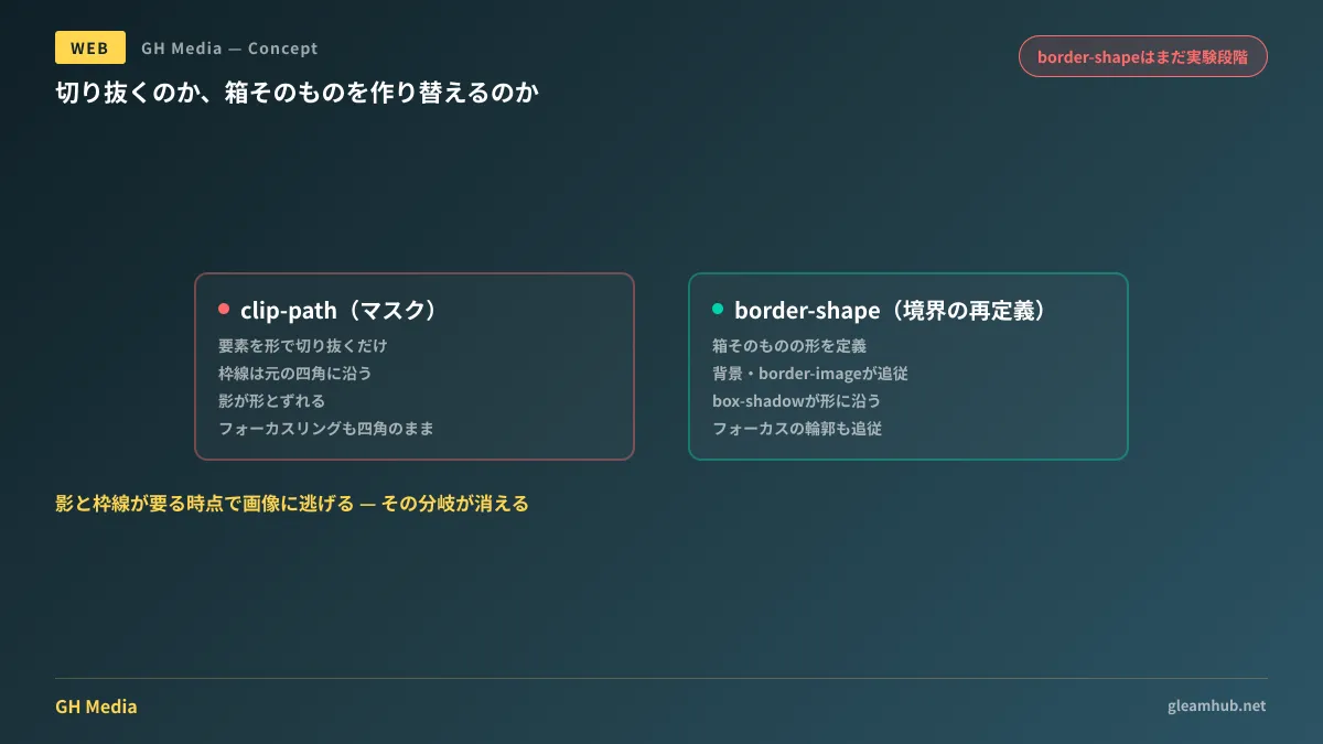
Visually, this achieves a diagonal cut. However, clip-path is a mask. It merely conceals element contents behind a designated shape, while the element itself remains a rectangle. This distinction has major practical consequences during implementation.
- Borders (
border) render along the original rectangle, and areas outside the clip disappear - Box shadows (
box-shadow) continue to cast as a rectangle, causing a visual mismatch with the clipped shape - Focus rings during keyboard navigation still display as rectangles
- As a result, designs requiring borders or shadows cannot use it, forcing a fallback to images
While the third point is often overlooked, it poses genuine harm to keyboard users. When the clickable target diverges from the active focus outline, users cannot tell where they are on the page. This represents a trade-off where accessibility is compromised for visual decoration.
border-shape reshapes the "box itself"
To address this, border-shape has been proposed. Part of the CSS Borders and Box Decorations Module Level 4, it defines the shape of the element boundary itself (border-shape — MDN Web Docs).
The decisive difference is that backgrounds, border-image, focus outlines, and box-shadow all conform to the new shape. Because it redefines the box rather than clipping it, no rectangle-bound rendering artifacts remain.
| clip-path | border-shape | |
|---|---|---|
| How it works | Clipping elements to a shape (masking) | Defining the element boundary itself |
| Borders | Follows the original rectangle; overflowing parts disappear | Drawn along the defined shape |
| Shadows and focus rings | Remains rectangular; desynchronized from the shape | Conforms to the defined shape |
| Fallback to images | Necessary whenever borders or shadows are required | Can become unnecessary |
Shapes can be defined using shape() and path(). While path() imports SVG path syntax directly and is restricted to pixel units, shape() uses native CSS syntax, permitting % and rem as well as math functions like calc() (shape() — MDN Web Docs). If building for fluid responsive layouts, shape() will be the preferred path.
Specifying a single value sets that shape as the boundary, with designated borders drawn along its perimeter. Providing two values designates the first as the outer boundary and the second as the inner boundary, filling the space between with the border color. The latter approach also makes it possible to create borders with non-uniform thickness.
The reality of when it can be used in production
To be entirely candid: it cannot be used in production today.
border-shape is currently in testing and can only be evaluated in Chrome Canary 146 or later with experimental Web Platform flags enabled. No implementation timelines have been announced for other browsers.
For comparison, consider the earlier addition of corner-shape (a property that turns corners styled with border-radius into chamfers, notches, or squircles): as of June 2026, it remains limited to Chromium-based browsers and is not part of Baseline (Squircles in CSS: corner-shape, superellipse() and Browser Support (2026)). Given that corner shaping is moving at this pace, expect a considerable wait before border-shape can be used reliably across all browsers. What is currently achievable with corner-shape is summarized in Unlocking Corner Styling with CSS corner-shape.
Furthermore, elements using border-shape ignore border-radius, and corner-shape—which relies on border-radius—also ceases to function. This is an easy point of confusion when trying to combine them in the future and wondering why rounded corners do not apply, making it well worth remembering.
Actionable steps you can take today
Dismissing this as "irrelevant because we can't use it yet" guarantees you will face the exact same dilemma years from now. There is one practical action you can take today.
Tally the locations across your website that rely on static images purely for shape styling. Specifically, audit for the following:
- Backgrounds of sections divided by diagonal cuts or wave patterns
- Cards or headers styled with notches, ribbons, or speech bubbles
- Elements that have text baked directly into them (the most painful culprit)
Elements matching item three represent points where every single revision incurs financial cost and delay. Once inventoried, restore high-frequency update elements back to live text first. Even if the precise shape cannot be fully replicated, having editable text delivers far greater operational value.
Beyond that, include a single line in your next website redesign requirements: "Do not bake text into images for decorative purposes." Whether your site is structured to drop in CSS replacements once specifications mature will determine your next renovation cost. Considerations around aligning with native CSS standards versus utility tooling are discussed in 2026: Tailwind or Standard CSS?, while migrating JS-reliant interactions back to CSS is covered in CSS Native Carousel.
If you want to audit where your site relies on images and identify where text can be restored prior to a redesign, GleamHub offers consultations for website development and redesigns. Because optimal configurations vary based on requirements, we provide customized estimates. Please contact us via Inquiries.
Sources
- border-shape CSS property — MDN Web Docs
- shape() CSS function — MDN Web Docs
- Get Ready For the Powerful CSS border-shape Property! — CSS-Tricks
- border-shape: the future of the non-rectangular web — una.im
- corner-shape CSS property — MDN Web Docs
- Squircles in CSS: corner-shape, superellipse() and Browser Support (2026) — Squircle.js


