
Sometimes a requirements specification contains just a single line: "Dark mode support." In estimation, it looks like a minor item. Once implementation begins, it splits into three distinct tasks: duplicate color definitions, toggle UI, and saving the selected state.
Among these, the one that usually consumes the most effort is the third. In particular, providing a three-way choice of "Light / Dark / Follow system settings" means persisting three states, branching three ways to prevent flash of unstyled content (FOUC), and testing six combinations in QA when multiplied by OS settings.
Whether those three options are genuinely needed became a subject of renewed debate in August 2026.
A Three-Way Choice Increases Test Combinations, Not Meaningful Options
Lea Verou raised the question of whether exposing three states is merely surfacing the data model directly in the UI. Internally, there are indeed three states: the user explicitly chose light, chose dark, or made no choice (following the OS setting). However, from the user's perspective at any given moment, one of those states is always completely irrelevant.
The reasoning is straightforward: toggling dark mode is an ephemeral adjustment to fix an immediate visibility issue. Users have only two goals: "The current display is fine, so continue reading," or "It is too bright/dark, so adjust it." An option asking users to state a preference about a problem that is not currently happening will simply never be clicked.
For the production team, the tangible impact is a multiplication of testing effort.
| Toggle approach | Persisted state | Combinations to verify in QA |
|---|---|---|
| 3 options (Light / Dark / System) | 3 states | 2 OS settings × 3 persisted values = 6 |
| 2 options (Light / Dark, default to OS) | 2 states + unset | 2 OS settings × 2 persisted values + unset = 4 |
Looking solely at the numbers, it is just a reduction from six to four, but in practice, eliminating the troublesome case of "the OS setting changes while 'System' is selected" saves substantial reproduction effort.
Two States Still Preserve "System Preference Tracking"
This is where misunderstandings often occur: dropping the three-way choice does not mean ignoring the OS setting.
The recommended model works like this: In the initial unset state, follow the OS setting. The moment the user clicks the toggle, persist that choice as an explicit override. Storing it in localStorage is perfectly fine.
In other words, "Follow system" is simply not exposed as a selectable option in the UI; as a state, it exists from the very beginning. If the user never touches the toggle, that state persists.
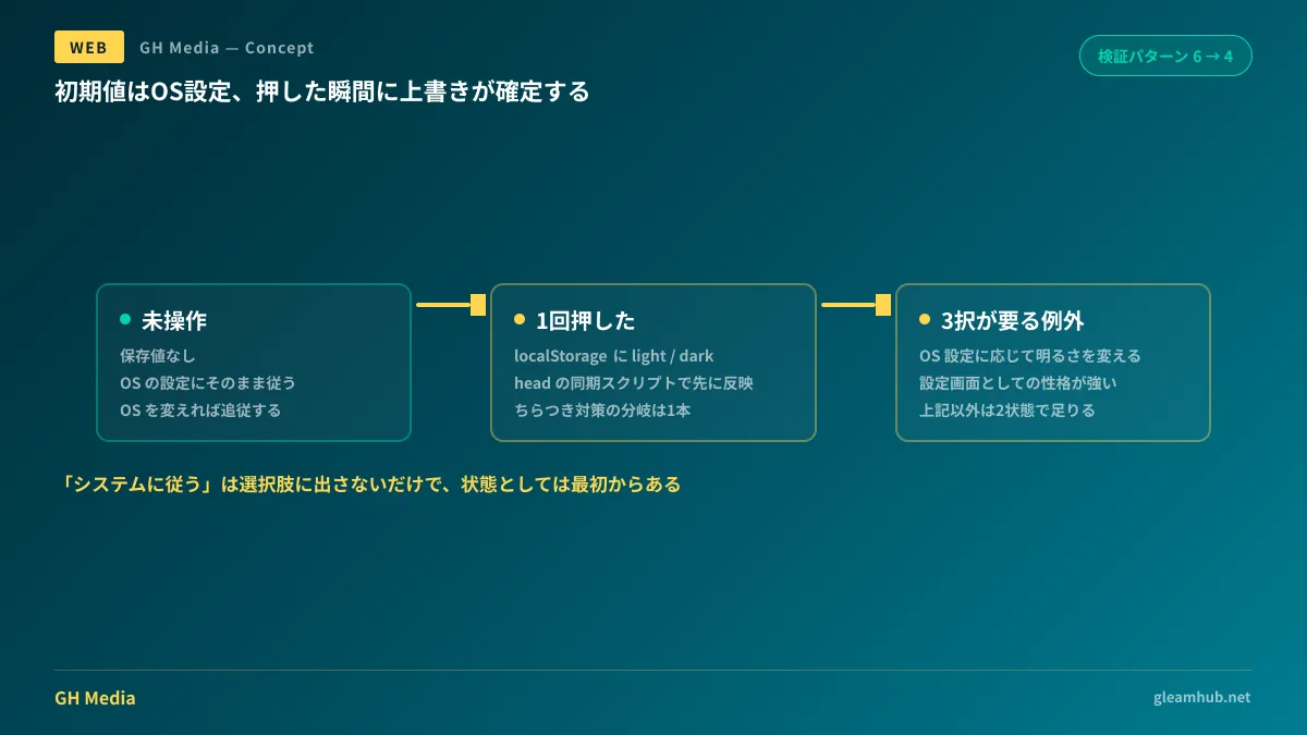
The implementation skeleton is as follows. To avoid flash, the persisted value is applied before stylesheets load using a synchronous script inside head.
<script>
  // 保存された上書きがあれば適用。無ければ何もせずOS設定に委ねる
  const saved = localStorage.getItem("color-scheme");
  if (saved === "light" || saved === "dark") {
    document.documentElement.style.colorScheme = saved;
  }
</script>
:root {
/* 上書きが無いときはOS設定に従う */
color-scheme: light dark;
}
body {
background: light-dark(#ffffff, #14171a);
color: light-dark(#1a1a1a, #e8e8e8);
}The toggle button simply checks the current effective value and persists the opposite. By not providing a path to "reset to system," the persistence logic and branching collapse into a single code path.
Furthermore, pairing light-dark() with color-scheme frees color definitions themselves from dual management. Guidance on how far to adopt recent CSS standards including these functions is detailed in Adoption Order Based on State of CSS 2026.
Some Architectures Justify a Three-Way Choice
A two-way choice is not universally correct in every circumstance. Verou herself noted exceptions: if the color scheme adjusts its brightness based on OS-side settings, exposing three states in the UI is justified.
Specifically, this applies when contrast or luminance differs between a dark theme when the OS is in dark mode versus a dark theme explicitly chosen by the user while the OS is in light mode. Under this design, the three states yield three genuinely distinct visual treatments, giving the choices actual purpose.
Counterarguments have also emerged on this topic. Proponents of three-state toggles point out that there is inherent value in allowing users to confirm whether they made an explicit selection or are simply following the OS. In UIs that function primarily as settings screens—places where users sit down deliberately to configure their environment—this argument can be more appropriate.
The decision axis hinges on whether the toggle represents an "ephemeral adjustment while reading" or an "item in account settings." A toggle placed in the header of a corporate or media site belongs to the former, whereas admin consoles and SaaS settings pages lean toward the latter.
What to Decide Upfront in Client Requirements Definition
From the perspective of a development team undertaking client work, this issue is worth settling before starting implementation. Discovering after development that the client expected a "reset to system button" means redoing both persistence logic and QA.
Here are the three points to clarify during the requirements definition phase:
- Where to place the toggle UI (persistent in the header or inside a settings page)
- Whether to vary brightness based on OS settings (if yes, three states are required)
- The scope of persistence (browser-local or bound to logged-in user accounts)
If the answer to the second question is "no," you can confirm a two-state model. This single question reduces downstream branching. The third point is often overlooked on sites with authentication. If there is a requirement to sync preferences across devices, the storage target moves to the server side, significantly altering requirements weight.
For designing color palettes and specifically ensuring contrast, When to Use Automatic Contrast Adjustment serves as a helpful reference.
What to do next
If a site you are currently building or maintaining uses a three-way dark mode toggle, check your analytics or event tracking to see how many users actually selected "System." If it is near zero, that option is generating QA costs without delivering value.
For new projects, simply add one line to the "dark mode support" row in your requirements specification: "Two-state toggle, defaulting to OS settings." That alone aligns assumptions for implementation and QA.
GleamHub offers website production and renewal consultations covering site redesigns, design system development for existing sites, and implementation standards for color schemes. Because the scope of rework varies depending on the existing architecture, we provide individual estimates. Please reach out to us via our contact page.


