

Because the design data specified a bottom margin of 24px for headings, you wrote margin-bottom: 24px exactly as instructed. Yet when viewed in a browser, for some reason it appears wider.
When measured with a digital ruler, it is indeed 24px, but visually it does not match. The designer asks, "Could you tighten it up a bit?", to which the implementer replies, "It's exactly as specified." This back-and-forth occurs even though neither side is wrong.
Margins are not just what you write
The cause is line-height. When the line height exceeds the height of the glyph itself, the remaining space is distributed equally above and below the characters. This is called half-leading.
If you set line-height: 1.5 on a font-size: 32px font, the line height becomes 48px, creating 8px of empty space both above and below the characters. If you add margin-bottom: 24px to this, the visual margin becomes 32px. Because the design data specifies 24px based on the character outlines, an 8px discrepancy occurs.
Since it is standard to make line-height smaller for headings and larger for body text, the discrepancy varies by element even when specifying the exact same margin. This is the true identity of feedback claiming "the margins don't match overall."
Until now, common workarounds generally fell into one of the following approaches:
- Subtracting the difference with negative margins (setting
margin-bottom: 16pxto balance the books) - Setting
line-height: 1only on headings (which makes lines overly cramped in Japanese) - Creating pseudo-elements with
::before/::afterand applying negative margins to them
All of these work, but the moment you change the font, everything shifts out of alignment. Because the amount of half-leading is determined by font-specific metrics (ascent and descent), swapping Japanese fonts or changing font weights forces you to recalculate adjustment values. CSS littered with negative margins leaves you with no idea how far those recalculations need to reach.
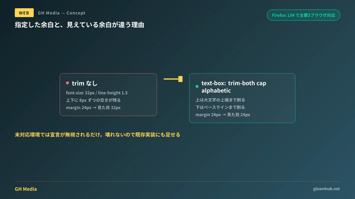
Properties to trim this spacing are now supported across major browsers
CSS now provides mechanisms to handle this directly: text-box-trim and text-box-edge, along with their shorthand text-box.
Safari supported it in 18.2 (December 2024), and Chrome and Edge supported it in 133 (February 2025), but because Firefox had not yet supported it, it remained difficult to use in production. With the release of Firefox 154 on August 18, 2026, it gained support, completing coverage across all major browsers.
The syntax is as follows:
h2 {
  font-size: 2rem;
  line-height: 1.4;

  /* 上下のハーフレディングを削る */
  text-box-trim: trim-both;
  /* 上は大文字の高さまで、下はベースラインまで */
  text-box-edge: cap alphabetic;
}

/* 一括指定 */
h2 {
  text-box: trim-both cap alphabetic;
}
text-box-trim specifies which sides to trim (trim-start / trim-end / trim-both / none). text-box-edge defines how far to trim. cap refers to the top of capital letters, ex to the height of lowercase letters, and alphabetic to the baseline.
If you apply this, the value written in margin directly becomes the visual margin. You only need to transcribe the specified values from the design data, eliminating the need for negative margin adjustments.
Furthermore, Firefox 154 simultaneously added support for sibling-count() and sibling-index(). These allow you to write rules purely in CSS based on element order; details are compiled in Building layouts based on element count purely with CSS. Since both became available in the same release, it is efficient to address them together when revising your implementation standards.
What to check when using them on Japanese sites
Metrics such as cap and alphabetic are baselines designed with Latin characters in mind. Because Japanese glyph bounds do not align perfectly with these baselines, you must verify against the actual font to see if the specified visual appearance is achieved.
Although the specification also defines baseline values for Japanese text, results vary depending on whether the font contains the corresponding metrics. For fonts used on your company's website, checking the following three places on actual devices is sufficient:
- Headings (large characters, tight line spacing) — where discrepancies are most noticeable
- Body text paragraphs (small characters, wide line spacing) — whether it appears overly cramped from over-trimming
- Lines with mixed Japanese and Western text — whether vertical baselines look aligned on lines mixing alphanumeric characters and Japanese
If the visual appearance does not look right, partial application—such as applying it only to headings while leaving body text untouched—is perfectly fine. This is not a property that must be applied uniformly to everything.
How it looks in unsupported environments
In browsers that do not support text-box-trim, this declaration is simply ignored. Rather than breaking the layout, it merely renders with margins that include half-leading as before.
In other words, there is no risk in adding it to your current implementations. It produces the intended margins in supported environments and retains the existing appearance in unsupported environments. Only when migrating away from existing code adjusted with negative margins, remember to remove those negative margins used for adjustment, as both would apply and cause excessive trimming.
Regarding the broader decision of how far to accommodate legacy environments, A client's guide to deciphering State of CSS 2026 organizes what should be agreed upon as implementation standards.
A single line to document in requirements
Discrepancies in margins between design and implementation can be reduced with just a single line in the specifications.
Specified margin values shall be based on character outlines, excluding font half-leading.
With this single line, implementers can build on the premise of applying text-box-trim, and designers can hand off specified values as is. Without it, discussions over which baseline to measure against occur for the first time only during client acceptance reviews.
What to do next
If you have a live website in operation, search your CSS and count the places where negative values are assigned to margin. If they are concentrated around headings and button labels, most are half-leading adjustments. If you plan to change fonts, that count will translate directly into your workload estimate.
If you are building from scratch or planning a redesign, decide at the outset whether to include text-box-trim in your heading style definitions. Adding it later requires auditing all existing adjustment values.
Website redesigns, building design systems for existing sites, and establishing implementation standards for margins and typography are handled through GleamHub's website production and redesign consultations. Because the scope of modifications varies depending on existing implementation architecture, we provide individual estimates. Please reach out through Contact Us.


