
A redesigned website was delivered as "accessibility compliant." When run through testing tools, all items are green, and the report notes zero issues.
However, when actually listening to the CEO greeting page with a screen reader, it reads out: "Image. Image. Image. Image zero one dot p-n-g."—even though checks passed, nothing is conveyed to visually impaired users.
This is not necessarily the result of cutting corners. It occurs because what automated checks measure and what clients expect are misaligned from the start.
Tools only check for presence
What standard accessibility testing tools evaluate regarding alt is only "whether an accessible name for screen readers is attached to that image." They do not evaluate whether the assigned name describes the image content.
In other words, all of the following will pass:
| Actually written alt | Automated check | What is conveyed when read aloud |
|---|---|---|
画像 | Pass | Nothing |
IMG_2847.png | Pass | File Name |
バナー | Pass | That some sort of banner exists |
| Same description attached to 10 images | Pass | Indistinguishable |
A green check is proof that alt text is present, not proof that the alt text is useful. If this distinction is mistaken during acceptance testing, a state where something supposed to be supported is actually unsupported will persist.
Why tools do not measure quality
This is not because it is technically impossible, but is an intentional design.
In an article published by GitHub about their accessibility testing initiatives, the reason is stated clearly. Rules that judge quality cannot avoid false positives. And rules that produce false positives get disabled by development teams. Once disabled, a rule is never turned back on. That is why many tools are built to look only at "presence," which can be determined reliably.
In other words, judging quality is left outside the tools. Someone has to define it, and someone has to review it. While some production agencies do this voluntarily, if it is not written into contracts or specifications, failing to do so is not a breach.
There are "obviously bad alt texts" that machines can catch
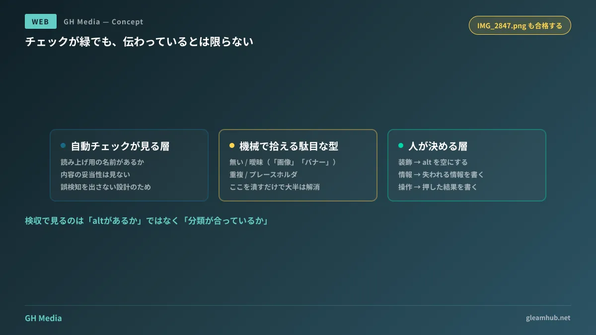
Even if overall quality cannot be measured, alt texts that are clearly non-functional follow distinct patterns. The plugin published by GitHub targets the following four for detection:
- Missing — The alt attribute itself is absent
- Vague — Contains only non-descriptive terms like "image," "photo," or "banner"
- Duplicate — The same description is repeatedly used across different images
- Placeholder — Incomplete placeholders like
IMG_2847.png,untitled, orここに代替テキスト
These four can be captured mechanically without human visual inspection. Simply eliminating these four during acceptance testing will almost entirely remove scenarios like the opening example where "everything is read as image."
Configurations utilizing language models are also available for more in-depth quality assessment, but these do not run by default. Enabling them requires configuration and API tokens. Furthermore, because image URLs can contain signed temporary tokens or session identifiers, processing is included to strip query parameters before passing them to the model. This reflects a design decision that sending URLs externally for inspection can itself become an information leakage vector. When implementing similar mechanisms on your own site, this point must be considered in the same way.
What clients should include in specifications
Specifications that merely state "consider accessibility" cannot serve as acceptance criteria. What should be written is dividing images into three categories and defining the handling for each.
- Decorative images (background decorations, divider lines, decorative icons). Adding descriptions to these is actively distracting. The correct approach is to remove them from screen readers using
alt="". Instructions to "add alt to every image" become harmful here. - Informative images (diagrams, graphs, photos, screenshots). The role is to supplement in text the information that would be lost if the image could not be seen. Write the function that the image serves on that page, rather than an exhaustive list of what appears in it.
- Functional images (icon-only buttons, image links). What to write here is not appearance, but what happens when clicked. For a magnifying glass icon, write "Search" rather than "Magnifying glass."
Including these three categories in specifications shifts the acceptance conversation from "is alt attached?" to "is the classification correct?" The latter can be confirmed by visual inspection.
There are many misunderstandings regarding the extent to which accessibility compliance is legally required, which are clarified in Misconceptions about mandatory accessibility. For an overview of compliance, refer to Basics of web accessibility. Principles for integrating automated checks into CI can be found in Automating accessibility testing.
Alt text written solely for SEO usually turns out bad
There is one more point that clients benefit from knowing.
Because search engines also read alt text, it is sometimes written with the intent of stuffing keywords. What results is a string of words that makes no sense to human listeners, such as "Tokyo website production cheap design agency."
This passes automated checks and does not dramatically impact rankings. However, it is nothing but noise for users listening via screen readers, diverging from its original purpose. When deciding what to write in alt text, the only criterion needed is: "What needs to be conveyed right now to someone who cannot see this image?" If keywords naturally fit as a result, that is fine.
What to do next
First, open your company site's top page and its most viewed page, right-click images, and inspect their alt text. Even without browser inspect tools, simply using an extension to hide images or running a screen reader once will reveal the situation. If "image" or "img" are all that appear, compliance is not complete even if the report is green.
On top of that, simply add the three classifications above to the specification for your next client web development procurement. There is no need to write elaborate guidelines. Leave decorative images blank, write lost information for informative ones, and write outcomes for functional ones. Just having this boundary in specifications will change delivery quality.
GleamHub accepts inquiries regarding website accessibility audits, acceptance criteria design for redesigns, and existing site improvements through our website production and renewal consultations. Because procedures vary depending on site scale and current status, please consult us individually via Contact.


