
Open an article on your site with a smartphone and look at the bottom right where your thumb naturally rests. An "↑" button floats there, accompanied by a floating button for inquiries or document requests—many websites use this layout.
In the easiest-to-reach area on the screen, a button directly driving business results and a button that merely scrolls to the top of the page are competing with each other. If asked which one to keep, the answer should be obvious; yet conversations often proceed assuming a "back to top" button is mandatory from the start. It is frequently included as "standard implementation" in development estimates without anyone questioning its necessity.
Most reasons for adding it duplicate features browsers already have
This component became widespread as a relic from an era when pages were long and scrolling options were limited. Today, the same action can be performed much faster.
- iPhone / iPad: Tapping the status bar at the top of the screen returns to the top
- PC: The Home key scrolls to the top
- Most browsers: Dragging the scrollbar allows instant navigation
A "back to top" button merely re-implements on screen what OSs and browsers provide natively. Of course, some users are unfamiliar with these shortcuts. However, users who do not know them often do not know what the "↑" icon in the bottom right means either. It sits in an awkward spot: unnecessary for those who know, and unintelligible to those who don't.
Clicking it may not return the screen reader focus
From an accessibility perspective, the problem lies in behavior, not appearance.
When implemented as a link to a fragment identifier like <a href="#top">, if the destination element cannot receive focus, focus may not move depending on the browser. While the visual scroll position resets to the top, keyboard navigation points and screen reader reading positions remain stranded at the bottom of the page. Meanwhile, #top is appended to the URL, needlessly cluttering browser history.
"The view moved, but the interaction point did not"—a state that never occurs with standard links or buttons. Resolving this requires measures such as adding tabindex="-1" to the target element so it can accept focus, yet implementations incorporating this are rarely seen.
If implemented merely by calling window.scrollTo() via JavaScript, focus does not move at all. Because this seems like a more natural implementation on the surface, the underlying issue becomes even harder to notice.
In addition, depending on the implementation, the following side effects can occur:
- Transparent click targets expand around the button, causing accidental taps when trying to click neighboring elements
- For users viewing with screen zoom, floating elements cover a significant portion of the main text
- At screen widths causing horizontal scroll, the button overlaps body text
The third point is also one of the items you should verify before declaring your site fully accessible. It cannot be caught by automated audit tools and is only discovered by zooming in on actual devices.
Assume there is only one slot for floating elements
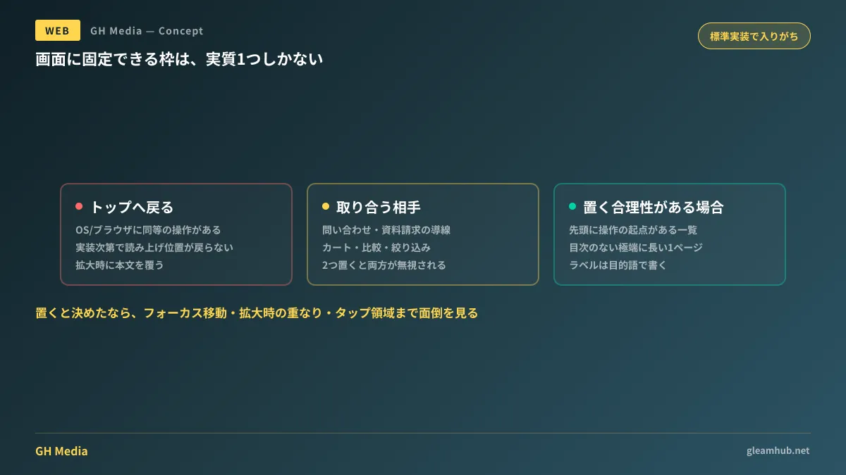
Practical decisions come down to this: There is a practical limit to the number of fixed elements you can display on a screen. The moment you place two, both inch closer to becoming "constant visual noise." If you place three, users will ignore them altogether.
If so, what to place in that single slot is determined by the site's primary objective.
| Site nature | What to place in the single floating slot |
|---|---|
| Corporate sites aimed at inquiries or document requests | Inquiry flow |
| Media sites focused on reading articles | Nothing (prioritize visible area for reading content) |
| E-commerce and comparison sites where users select products | Elements maintaining in-progress selections, such as cart, comparison, or filtering |
There are very few scenarios where "back to top" belongs in this table. If it does, it would be on sites where returning to the top is itself a core user task flow.
Conditions where you should still include one
This is not to say it is categorically unnecessary. If any of the following apply, there is a reasonable case for including one:
First, pages where the starting point of interaction is at the top, and users are expected to return there repeatedly. Listing pages where search filter forms reside at the top, requiring users to scroll down through results and return to modify criteria, fit this description. In this case, labeling it "Change search filters" rather than "Back to top" makes the purpose much clearer.
Second, exceptionally long single pages. Landing pages or company history pages spanning dozens of screen lengths without internal page navigation fall into this category. However, in such cases, the real solution is providing a table of contents or means to navigate between sections, not merely funneling users back to the top.
If you decide to include one, ensure your implementation satisfies at least these criteria:
- Focus moves to the destination element (by adding
tabindex="-1"or explicitly shifting focus via script) - Respect
prefers-reduced-motion(smooth scrolling can cause discomfort for motion-sensitive users; this is a consideration common to all scroll-linked animations) - Tap targets match visual boundaries (do not artificially expand click areas with transparent padding)
- Does not obscure body text during magnified view
What to do next
First, open your website on a smartphone, scroll halfway down an article page, and take a screenshot. Count how many floating elements appear in the bottom third of the screen. If there are two or more, you can immediately decide to drop one.
Next, check your analytics to see how often that "↑" button is actually clicked. If you haven't set up event tracking, start there. There is no reason to keep something that isn't clicked in the exact same spot as user pathways directly tied to business results.
At GleamHub, we offer website creation and redesign consultations covering floating UI optimization, mobile user flow design, and accessibility audits for existing websites. Because the ideal solution depends on your site goals and page structure, please consult with us individually via our Contact Us page.


