
Right after a rebuild, we sometimes hear this. "The design turned out really well. People internally like it. It is just that I feel inquiries have dropped." Traffic has not fallen. Time on page has actually risen. And yet only the number reaching the form has dropped.
Look for the cause and you usually arrive not at the content of the page but at fewer cues for interaction. The global menu is trimmed to three items, the inquiry button disappears from the header into the hamburger, and the form is there if you scroll to the very bottom. The number of steps before a visitor finds "where to press" has gone up one at a time.
Proposals to hide the controls are on the rise
This is not a matter of taste on the agency side; it is arriving as an industry-wide current. In September 2026, Smashing Magazine argued in an article titled "The Death Of The Button" that the web is moving beyond menus, forms and repeated clicks toward experiences built around human intent. It says the UX designer's role also shifts from designing visible interfaces to transparently guiding intent-reading AI experiences.
As a direction, the argument makes sense. There really are situations where having someone tell you is faster than making them search and choose. But there is one failure that happens easily when you lean this way: removing the old entry point before adding the new one.
A mechanism that reads intent works powerfully for people who can put their intent into words. It does not work for people who do not know what to ask, people who are in a hurry, or people who never notice they can type there at all. Inquiries on a corporate site are an area where the latter share is by no means low.
Hidden controls only reach people who can find them
Techniques for hiding controls share a common pattern in how the impact shows up.
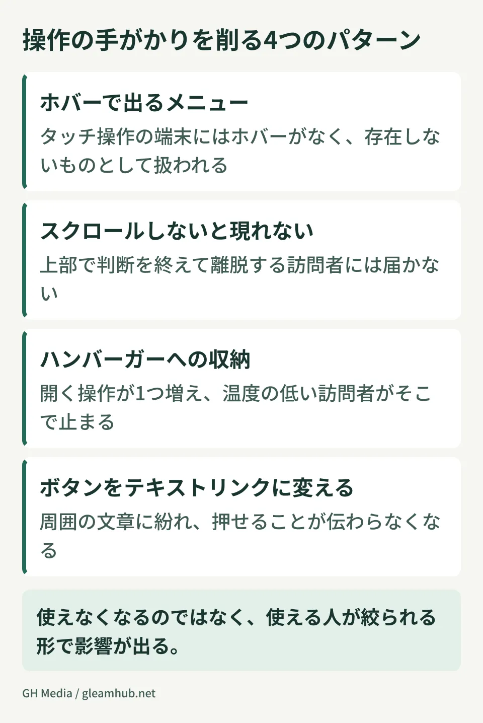
- Menus that appear on hover — touch devices have no hover to begin with. On sites with many smartphone visits, this form of control is effectively treated as not existing
- Elements that appear only after scrolling — they never reach people who decide at the top of the page and leave. Unless you measure reach, you cannot tell they are not reaching anyone
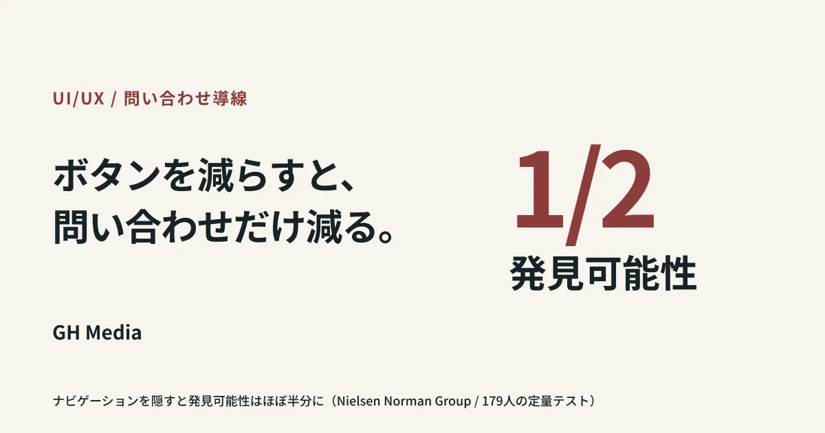
- Tucking items into a hamburger menu — one extra action to open it. A single addition looks small, but visitors who are only at the temperature of "maybe I will ask" stop here. In a quantitative test of 179 people by Nielsen Norman Group, hiding navigation cut discoverability roughly in half, reduced the share of people who used it, and pushed use later into the task when it did happen
- Turning buttons into text links — it becomes harder to tell they can be pressed. Once an element blends into the surrounding prose, it is no longer recognized as a control
None of these makes anything unusable; the impact shows up as narrowing who can use it. That is why reviews on the agency side find no problem. The people who built it know where things are, so they can press everything.
What you can remove, and what stops working when removed
Keep everything and the screen turns cluttered. The criterion is whether that control has an alternative route.
Anything with an alternative can be removed. A back-to-top button can be replaced by standard browser or OS actions. How to judge this kind of element is covered separately in whether a back-to-top button is necessary. Social share buttons, print buttons and text-size controls are also often replaceable by standard features or another location.
Anything without an alternative cannot be removed. Inquiries, document requests, the phone number, the entry points to pricing and case study pages. Visitors have no other way to reach these on their own. Hide something with no alternative route outside the site, and the opportunity simply disappears.
If you are unsure, trace whether "this visitor can achieve their goal" with that element removed, from the perspective of someone who does not know the site's structure. Builders and people inside the company cannot run this test, because they already know.
One more note: in the opposite direction from trimming controls, there are cases where the form itself is unintentionally blocking the action. The problem where confirming a Japanese input conversion submits the form is an example of something broken rather than removed (unintended submission with Japanese input). When inquiries drop, first separate whether you hid something or broke something.
Add a new entry point alongside, not in place of
The decision to add an entry point where people can ask an AI is not a bad one in itself. The problem is how you add it.
Start by adding one more entry point while keeping the existing path. Put a chat window where people can ask, and keep the inquiry button in the header at the same time. Which one gets used cannot be known until you put it there. Put it there and compare, and the decision to remove can come later. Remove first, and you never get the numbers to compare with.
If you add an entry point where an AI responds, it has to be built so that visitors understand what it can and cannot do. The thinking here is covered in transparency UX for AI agents. Present it as "ask and it will answer anything" and, when it cannot answer, people will not move on to the inquiry form either.
Check the drop with numbers, not with impressions
Half of the "I feel inquiries have dropped" cases really have dropped, and half are seasonal variation. Three numbers separate them.
- Arrivals at the inquiry page. Are people reaching the form, or disappearing before they get there? This is where it splits
- Clicks on the main paths. The header button, links in the body, the footer. Knowing which ones are used makes the effect of what you hid directly visible
- Completion rate after reaching the form. If people arrive but do not complete, the cause is the form, not the path to it
If you have had no inquiries at all for a while, the cause can sit at a stage earlier than the paths. That separation is set out in fixing a site that gets no inquiries. And if you cannot tell which of the submissions you do receive are genuine prospects, telling real inquiries apart from a flood of sales email comes first.
What to do next
Open your own site on a smartphone and check whether you can get to the inquiry form from the top page without scrolling once. If you cannot, that is the first place to fix.
Then write down, as far as you can recall, the controls removed in your most recent rebuild, and note against each whether there is an alternative route. If even one has no alternative, it is worth putting back.
GleamHub handles reviews of site path design and separating out metrics that fell after a rebuild, through our website build and rebuild consultation. The order of fixes depends on your current configuration and how visitors arrive, so please get in touch from our contact page.


