An announcement card placed in the sidebar keeps its side-by-side layout in the narrow space and breaks. If you try to fix it with media queries, the branches keep multiplying, because at the same screen width the card displays correctly in the main column. Even when you apply container queries to this symptom, you can get stuck at "I wrote it, but nothing changes."
In September, Smashing Magazine pointed out that although browser support is in place, container queries are not used much and are easily misunderstood. The cause of misuse it cited was that they look almost identical to media queries.
Same shape, but measuring different things
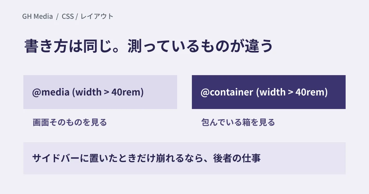
@media (width > 40rem) and @container (width > 40rem) are written almost the same way. That visual similarity leads directly to misuse.
Media queries look at the viewport, that is, the screen itself. Container queries look at the dimensions of the ancestor element that wraps the element. The same card is wide when placed in the main column and narrow when placed in the sidebar. Container queries are the mechanism for switching according to that placement.
So replacing the places where you want to branch on screen width with container queries gains you nothing. The structure of the overall layout, such as whether to show a sidebar at all, remains the job of media queries, as before.
| What you want to branch on | What to use |
|---|---|
| Overall page structure (columns, whether there is a sidebar) | Media queries |
| Component contents (card orientation, hiding elements) | Container queries |
| Print, color scheme preference, reduced motion | Media queries (feature-specific conditions) |
What to check, in order, when it doesn't work
If nothing happens after you write @container, the cause is almost always in one of a few predictable places.
- Is
container-typeset on the wrapping element? Unless you putinline-sizeon the parent side, the child's@containerhas nothing to refer to - Is it referring to the ancestor you intended? If you don't specify one by name (
container-name), the nearest ancestor withcontainer-typeis chosen. If there is another container in between, it looks at that one - Is the element referring to itself? You can't change a container's own size with that container's query. It would create a loop: the width changes, the query result changes, and the width changes again
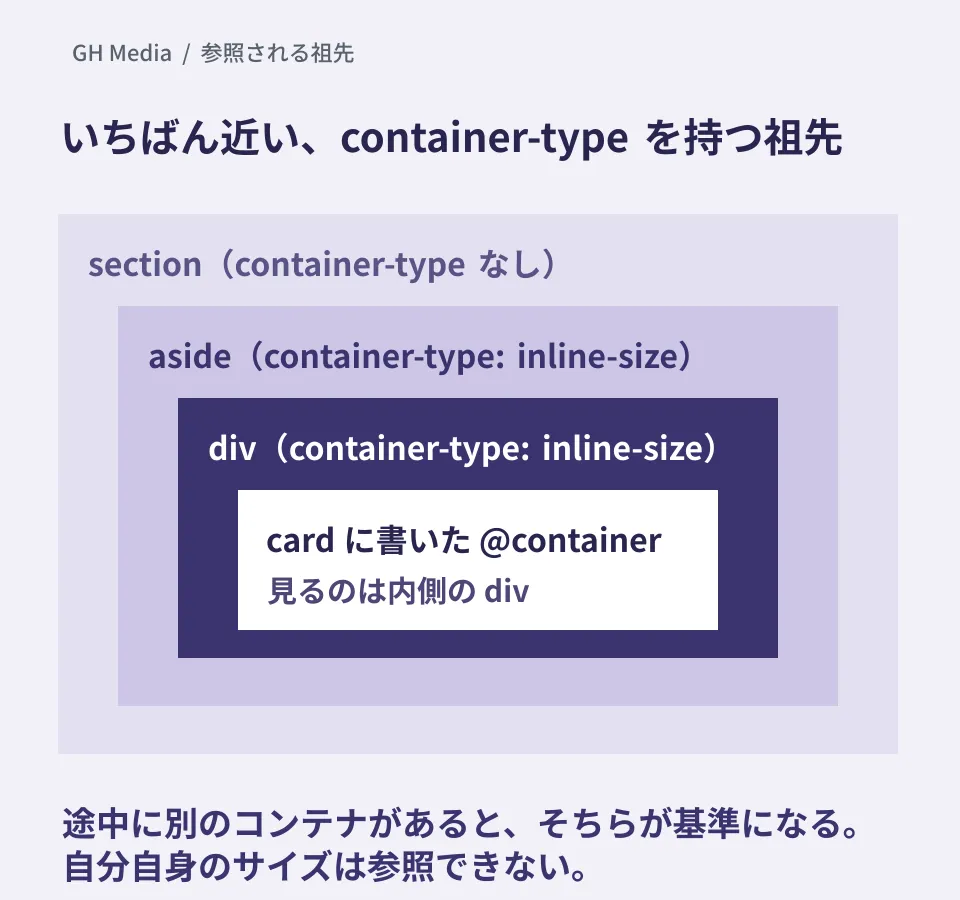
The point to look at in the diagram is the second item. When elements with container-type are nested, the child refers not to the outer one but to the nearest inner one. When it doesn't branch at the width you intended, first check whether another container sits between the element and the ancestor. If you want a specific ancestor as the basis, give that ancestor a name with container-name and specify that name on the @container side.
The third item is an easy place to stumble when first learning this. Rather than changing the card's own width with @container, think of it as changing how the contents are arranged based on the box that wraps the card, and the design becomes more straightforward.
Where replacing is worth it
This is not about rewriting all the CSS on an existing site. Container queries pay off where the same component is placed in multiple locations.
In the CSS of sites that have been run for a long time, derived classes may have multiplied for each placement, such as card--sidebar card--narrow card--footer. Some of them were created only because "the width is different." Moving those variants to container queries brings the component back to one.
Conversely, there is no reason to use them for components placed in only one location, or components whose width doesn't change in the first place. The more containers you add, the more effort it takes to track which ancestor is being referenced.
We explain how to rebuild these as components in building UI that holds up wherever it is placed with container queries. For deciding which features you can rely on, see setting your support range with Baseline, and for moving processing you had been handling with JavaScript back into CSS, see shipping less JavaScript.
How to handle older browsers
In environments that don't support container queries, everything inside @container is ignored. You can handle this behavior through the order in which you write the CSS.
If you write the narrow appearance as regular CSS and put the changes for wider sizes inside @container, environments without support will display the narrow appearance. Instead of breaking, the layout simply doesn't change. If you make the wide version the default instead, unsupported environments will show the wide layout in narrow spaces, and it will break.
How to choose where to start
Start the refactoring with the component that has the most derived classes. Look at why each class was split off, one at a time, and count only those that exist "because of width." As an editorial rule of thumb, if there are three or more, it is worth moving them to container queries. If there are only one or two, it is fine to leave things as they are.
We checked the Smashing Magazine article and MDN's documentation through web searches on September 24, 2026. We have not tested the CSS behavior covered in this article on actual devices in each browser, nor applied it to existing sites. This article organizes the specifications and provides material for deciding on refactoring.
For CSS refactoring of an existing site or rebuilding components, please consult GleamHub.