When you line up cards of different heights in a portfolio or blog listing, each row aligns to its tallest card, leaving gaps below the others. To close these gaps with a "masonry (stonework) layout," the common approach until now has been a JavaScript library or multi-column layout (columns) to approximate the look. Because multi-column layout flows content from top to bottom, new articles end up at the bottom of the left column, which does not suit listings meant to be ordered "newest first from the top left."
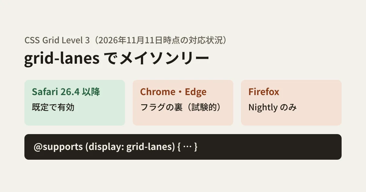
In CSS, a specification for writing this layout with display: grid-lanes is progressing. However, as of November 11, 2026, only Safari supports it by default. In this article, we check browser support using each browser's release notes and source code and MDN's compatibility data, and based on the results of actually comparing rendering in Chromium, we sort out how to use it for now.
What grid-lanes changes
MDN's guide "Grid lanes layout" explains that Level 3 of the CSS Grid Layout specification defines a layout method used with the grid-lanes and inline-grid-lanes values of display. One axis uses strict tracks like a regular grid, and the other axis uses a packed, stacking layout. Each item is placed in the lane (column) with the most free space.
The syntax is almost the same as a regular grid.
.works {
  display: grid-lanes;
  gap: 10px;
  grid-template-columns: repeat(auto-fill, minmax(240px, 1fr));
}
Column widths are set with grid-template-columns, and row heights are not set. You can create a card spanning two columns with span, or place an item in a specific column with grid-column. Items with a specified column are placed before the packing process.
Note that the grid-template-rows: masonry syntax, which was previously implemented experimentally, has been replaced by grid-lanes in the specification. MDN's developer release notes for Firefox 159 (released October 27, 2026) say this old syntax (the masonry value of grid-template-columns and grid-template-rows, and the masonry-auto-flow property) was removed. This old syntax was originally enabled by default only in Firefox Nightly. Avoid copying code examples from older articles as is.
Browser support as of November 2026
We checked browser support using MDN's compatibility data (mdn/browser-compat-data) and the feature-enablement settings in each browser's source code. For Safari, Apple's "Safari 26.4 Release Notes" (released March 24, 2026) also says "Added support for CSS display: grid-lanes."
| Browser | Compatibility data | Source code setting |
|---|---|---|
| Safari(macOS・iOS) | Supported in 26.4 | WebKit's GridLanesEnabled is status: stable, default value true |
| Chrome・Edge | Not supported | Chromium's CSSGridLanesLayout is status: experimental |
| Firefox | Preview | The layout.css.display-grid-lanes.enabled value is true only in Nightly builds |
According to the description in Chromium's settings file, experimental features are disabled by default in stable releases and can be used by enabling "Experimental Web Platform features" in chrome://flags. In other words, grid-lanes does not yet work in Chrome and Edge, which most ordinary users use. The compatibility data also still classifies it as "experimental."
In "Chrome Platform Status," which tracks planned Chrome features, it is listed from Chrome 140 as a stage where developers can try it behind a flag (Dev trial), with no date given for an official release. The implementation status field says "No active development," but a note on the same page says it is "still being implemented," and the name change discussed later landed in Chromium in October as well. Either way, it is not yet possible to foresee when it will be available by default in Chrome.
Comparing rendering in Chromium
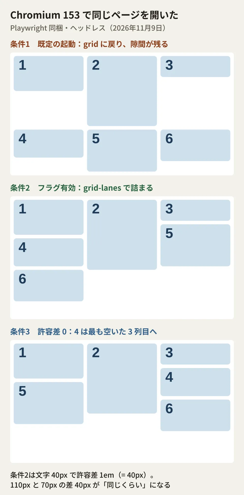
On November 9, 2026, when we wrote the draft, we opened the same HTML in two launch modes using the Chromium bundled with Playwright (153.0.8010.12, headless) in the Linux cloud environment the editorial team used. The test page placed six cards with heights of 100, 200, 60, 80, 120, and 90px in a three-column grid with 200px columns. It switches to display: grid-lanes only when @supports (display: grid-lanes) is true.
.works {
  display: grid;
  grid-template-columns: repeat(3, 200px);
  gap: 10px;
}
@supports (display: grid-lanes) {
  .works { display: grid-lanes; }
}
The results were as follows.
- Default launch:
CSS.supports('display', 'grid-lanes')was false. The computed value ofdisplayremainedgrid, the cards aligned in two rows, and a gap remained below the tall card in the first row. The container height was 330px - Launch with Experimental Web Platform features enabled (
--enable-experimental-web-platform-features):CSS.supportswas true, and the computed value wasgrid-lanes. The cards were packed into the columns with free space, and the container height became 290px
If you branch with @supports, browsers that do not support it show the regular grid layout, and nothing breaks. You can use it as progressive enhancement, where gaps are closed only in browsers that support it.
Placement order is not always "the emptiest column"
During testing, simply changing the font size changed which column a card went into. The deciding point was whether the fourth card went into the first column (free from 110px from the top) or the third column (free from 70px). On a page with a 40px font size, it went into the first column, and when we set the tolerance to 0 with the flag still enabled, it went into the third column, which had the most free space.
The reason lies in the specification's fit-tolerance property. The CSSWG Editor's Draft (css-grid-3) defines that if the difference in free space between columns is within this value, they are treated as "about equally free" and filled in order starting from the earlier column. The initial value normal is treated as 1em in grid-lanes. With a 40px font size, 1em is 40px, so the 40px difference between 110px and 70px counted as "about equal," and the first column, which comes earlier, was chosen.
Another caveat is the property name. In October 2026, the CSSWG renamed the specification's flow-tolerance to fit-tolerance. Browser support is as follows, and the accepted name differs by version.
- Safari: 26.4 added support with
flow-tolerance(26.4 release notes and compatibility data). Safari 27.2, released October 26, 2026, changed it tofit-tolerance, andflow-toleranceremains usable for the time being as a deprecated alias (27.2 release notes and the WebKit blog). As of November 11, the compatibility data does not yet reflect this rename - Chromium: The Chromium 153 we tested accepted only the old
flow-tolerance(CSS.supports('fit-tolerance', '0')was false). The rename tofit-tolerancelanded in Chromium on October 14 and is included from Chrome 158 (stable release scheduled for November 17). The current property definition no longer keepsflow-toleranceas an alias (we have not tested rendering in 158) - Firefox:
fit-tolerancewas added in Nightly behind the same setting as grid-lanes
To make it work in both older and newer versions, you need to write both names side by side.
@supports (display: grid-lanes) {
  .works {
    display: grid-lanes;
    flow-tolerance: 0; /* 旧名(Safari 26.4〜27.1、Chrome 157まで) */
    fit-tolerance: 0;  /* 仕様の名前(Safari 27.2以降、Chrome 158以降) */
  }
}Visual order and keyboard order diverge
The draft specification has a section called "Reordering and Accessibility," which says that auto-placement in grid-lanes can produce layouts that jump back and forth relative to reading order. In particular, when you mix cards that span columns or cards placed in specific columns, a later card can end up above an earlier one. The draft suggests designing to minimize this back-and-forth, and, when the items have no meaningful order, using the reading-flow property to let the browser rearrange the reading order.
From here on is the editorial team's take. When "newest first" matters, as in portfolio or news listings, users get confused if the HTML order (the order in which screen readers and the Tab key move) differs from the order the eye follows. The following three guidelines make it easier to keep this mismatch in check.
- Do not mix cards that span columns (
span) with cards of very different heights in the same listing - Use a larger tolerance so that columns of similar height are filled from left to right (the WebKit blog also recommends making the value quite large in most cases, for users who navigate with the Tab key)
- Tab through the links inside the cards in order and check that the navigation order does not differ greatly from the visual order
When rebuilding a listing layout with new CSS features, the basic approach is to make it work acceptably even in browsers where the feature has no effect, as in our article on designing with Web Platform Baseline. We covered the new specification for drawing lines in grid gaps in our article on CSS gap decorations.
How to use it for now
As long as only Safari enables it by default, you cannot yet build designs that depend on grid-lanes. If you use it, it would look like this.
- Build the listing with a regular
display: gridso that it still looks fine even if gaps remain - Switch to
grid-lanesonly inside@supports (display: grid-lanes) - Check the rendering and Tab key order in Safari (on a real device) and in Chrome with the flag enabled
- If you adjust the tolerance, write both
flow-toleranceandfit-tolerance
It is not yet time to immediately replace JavaScript masonry libraries on existing sites with CSS. A realistic approach is to leave room for a future replacement when building new listings.
Scope of verification
On November 9, 2026, we reviewed MDN's guide "Grid lanes layout" and the Firefox 159 developer release notes (mdn/content, d560306), MDN's compatibility data (mdn/browser-compat-data, 82daeeb), WebKit's
UnifiedWebPreferences.yaml, Chromium'sruntime_enabled_features.json5, Firefox'sStaticPrefList.yaml(all on the main branch as of that day), and the source of the CSSWG Editor's Draft css-grid-3 (w3c/csswg-drafts, b6771fb) (document research). Before publication, on November 11, 2026, we rechecked the live MDN pages, the CSSWG Editor's Draft (October 21 version), the compatibility data (c98444a), and the settings in each browser's source, and also checked Apple's Safari 26.4 and 27.2 release notes, the WebKit blog post "WebKit Features for Safari 27.2," Chrome Platform Status, and the Chromium rename commit (957a2cc). The rendering comparison used Chromium 153.0.8010.12 (headless) bundled with Playwright in a Linux cloud environment, with one run per condition (hands-on testing). We have not checked rendering in Safari, Firefox Nightly, Chrome 158 or later, or on Windows, macOS, or smartphones.
GleamHub accepts consultations on website development and renewal, including rebuilding listing pages on corporate sites and adopting new CSS. Since the approach depends on the range of browsers you need to support, please reach out via our contact form.
References
- Grid lanes layout(MDN)
- Firefox 159 release notes for developers(MDN)
- mdn/browser-compat-data — css/properties/display.json
- mdn/browser-compat-data — css/properties/fit-tolerance.json
- CSS Grid Layout Module Level 3 (Editor's Draft)
- Safari 26.4 Release Notes(Apple Developer)
- Safari 27.2 Release Notes(Apple Developer)
- WebKit Features for Safari 27.2(WebKit Blog)
- CSS Grid-Lanes (i.e. Masonry)(Chrome Platform Status)
- Chromium — [Masonry] Rename flow-tolerance to fit-tolerance
- WebKit — UnifiedWebPreferences.yaml
- Chromium — runtime_enabled_features.json5
- Firefox — StaticPrefList.yaml