

Have you ever experienced modal issues remaining as the last feedback items during site acceptance inspection? Even when it looks exactly as designed, something inevitably gets flagged as you work through the checklist items: it doesn't close with the Esc key; the background scrolls while it is open; or pressing Tab repeatedly causes focus to escape to links outside the modal.
The fact that the same areas fail every time is not a matter of developer attentiveness. It is because those are native browser capabilities, areas where building custom structures using div elements instantly creates the need to rewrite everything by hand. And hand-written implementations tend to slip up in slightly different ways on every project.
The prior decision of whether something should be presented as a modal or placed on a separate page in the first place is covered in Deciding between modals and separate pages without second-guessing. This article discusses implementation after deciding to present content in a modal.
What you always end up writing yourself when building with div
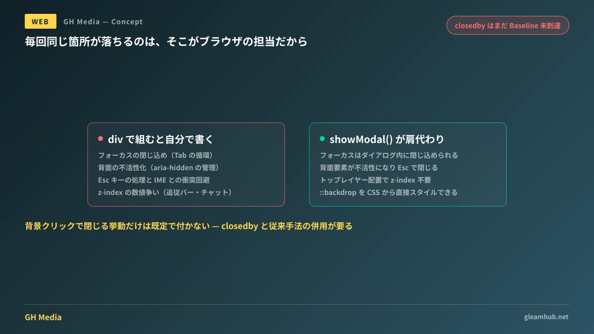
In custom modal implementations, omissions typically occur across the following four areas:
- Focus trapping — Ensuring Tab and Shift+Tab cycle within the modal. This often ends up implemented by detecting the first and last elements and manually returning focus, which breaks when content changes dynamically.
- Background inertness — Hiding background links and buttons from keyboard navigation and screen readers. You end up having to manually manage adding and removing
aria-hidden. - Esc key handling — Capturing key events to close the dialog. Issues frequently arise with nested modals or conflicts with IME composition during text input.
- Stacking order — How high to raise the
z-indexvalue. It turns into a contest against sticky header bars or third-party chat widgets, with the numbers growing larger as the project progresses.
Among these, the final battle over z-index is not an issue of implementation skill, but of structural design. As long as you are comparing numbers within the same stacking context, the cycle of winning and losing will continue.
Scope handled by showModal()
When you open a <dialog> element using showModal(), all four items above are handled collectively by the browser.
<dialog id="confirm-dialog">
  <form method="dialog">
    <h2>送信内容の確認</h2>
    <p>この内容で送信します。よろしいですか。</p>
    <button value="cancel">キャンセル</button>
    <button value="submit">送信する</button>
  </form>
</dialog>

<button id="open">確認する</button>
const dialog = document.getElementById('confirm-dialog');
document.getElementById('open').addEventListener('click', () => {
dialog.showModal();
});
dialog.addEventListener('close', () => {
// dialog.returnValue に押されたボタンの value が入る
console.log(dialog.returnValue);
});When opened with showModal(), focus is trapped inside the dialog, background elements become inert, and pressing Esc closes it. Because rendering is placed in the top layer outside normal stacking contexts, there is no need to write z-index. Conflicts with headers or chat widgets vanish at this point.
When using a form with method="dialog", submitting closes the dialog, and the clicked button's value is populated into returnValue. You avoid having to maintain your own state variables to distinguish whether the dialog was canceled or confirmed.
The background backdrop exists as the ::backdrop pseudo-element, allowing direct manipulation via CSS.
#confirm-dialog::backdrop {
  background: rgb(0 0 0 / 0.5);
  backdrop-filter: blur(2px);
}
Note that even with the same <dialog>, opening it with show() (non-modal) provides neither focus trapping, background inertness, nor a backdrop. The key branching point here is that if you intend to use it as a modal, use showModal().
Writing backdrop click-to-close cleanly
This is where people stumble most with <dialog>. By default, clicking the backdrop does not close the dialog. Because modals are designed around "a question that must be answered," default behavior leans toward persisting on screen.
The workaround used for a long time was checking the click event on the dialog itself and closing it if the event target was the dialog element. Since the backdrop is not a child element of the dialog, clicks on the backdrop reach the dialog element.
dialog.addEventListener('click', (event) => {
  if (event.target === dialog) dialog.close();
});
However, this approach has a known flaw. If padding is applied to the dialog itself, clicks on its padding area also count as clicks on the dialog element, causing the dialog to close simply by clicking near the inner edge. This requires extra countermeasures, such as placing a wrapper element inside and applying the padding there instead.
Replacing all of this with a single attribute is closedby.
| Value | Closing action |
|---|---|
any | Closes on both outside click and Esc (same behavior as popovers) |
closerequest | Closes on Esc or device back actions, but does not close on outside clicks |
none | Closes only when closed programmatically via code |
<dialog id="confirm-dialog" closedby="any">
  <!-- ... -->
</dialog>
Because closerequest matches the default modal behavior, the ones worth writing in production are any and none. none is effective in cases where you want to prevent accidental closure while unsaved input remains.
Support status and how to write fallbacks
closedby is supported in Chrome and Edge from version 134 and Firefox from version 137, with Safari also following along as part of Interop 2026. However, at the time of writing, it has not yet reached Baseline. Because client web development deliverables frequently require guaranteed operation including older versions of Safari, relying exclusively on the attribute should be avoided.
A realistic approach is to declare the attribute while retaining conventional click detection for unsupported browsers. You branch based on feature support to ensure closing logic does not trigger twice in environments where the attribute is active.
const supportsClosedBy = 'closedBy' in HTMLDialogElement.prototype;

if (!supportsClosedBy) {
  dialog.addEventListener('click', (event) => {
    if (event.target === dialog) dialog.close();
  });
}
When adding closing animations, use requestClose() rather than close(). Because requestClose() fires the cancel event before closing, you can insert logic such as asking "You have unsaved changes; do you want to close?" or waiting for transitions to complete before actually executing the close.
Because switching display states for top-layer elements involves changes to display, straightforwardly writing transition will not take effect. You must combine @starting-style and transition-behavior: allow-discrete; after confirming support status here, it is safest to adopt a progressive enhancement approach where functionality remains unaffected even if animations do not run.
The decision of how far to replace browser-standard components with custom implementations repeatedly arises with form controls as well. The current landscape there is summarized in How far can form controls be customized with CSS?
What to do next
If modals in your current project are built using div, first check simply whether repeatedly pressing Tab allows focus to escape outside. If it escapes, that modal is continuous with the background page for screen reader users.
If you find it escapes, evaluating a migration to <dialog> + showModal() is well worthwhile. Visual CSS can be reused almost entirely as-is, while focus management and z-index adjustment code are eliminated.
If you would like to consult on accessibility remediation for existing sites or standardizing components, we assist through GleamHub's Development, AI, and Automation Consultations. Because the replacement scope varies depending on your existing implementation structure, please reach out for an individual consultation. Feel free to contact us via Contact Us.
Sources
- Using and Styling the Dialog Element — CSS-Tricks
- <dialog>: The Dialog element — MDN Web Docs
- HTMLDialogElement: requestClose() method — MDN Web Docs
- <dialog closedby> — Web platform features explorer
- Revisiting how to dismiss native HTML dialog elements when the backdrop is clicked — Go Make Things
- Enhance Dialogs with the closedby Attribute — Oida, is des org!


