

The initial design concept for a corporate website redesign arrives. You present it to an executive, who pauses before saying, "Hmm, it just feels off somehow"—the costliest pitfall in web development almost always begins with this single line.
What follows is nearly identical across companies. Unable to articulate what feels off, teams cycle through endless rounds of changing colors, swapping photos, and tweaking whitespace. Three weeks pass, original budgets and timelines collapse, and everyone ends up asking, "Wouldn't the first draft have been fine?" This is not a matter of the design team's skill. The root cause is demanding a judgment without having established any criteria for judgment.
Unpacking "give it a modern, trustworthy feel"
When communicating a brand or website direction, certain buzzwords almost always emerge: modern, trustworthy, premium, approachable, innovative.
An article published in Smashing Magazine pinpointed this dynamic accurately: branding projects often fail far earlier than the logo or visual stage—they fail during the strategy phase, where terms like "modern," "trustworthy," "premium," and "approachable" are tossed around without ever being defined (From Kickoff To First Concept: How To Turn Brand Strategy Into Visual Direction — Smashing Magazine).
Why are these words so dangerous? Because every stakeholder envisions a completely different picture for the exact same word.
Hearing "a trustworthy website," one executive pictures subdued navy tones and structured divider lines. Another executive imagines prominent portraits of the leadership team alongside solid performance metrics. The sales department envisions client logos lined up right above the contact form. All three agree that "trustworthiness matters," yet all three are asking for entirely different things.
If you present an initial draft in this state, someone will inevitably say "it's off," no matter what design you put forward. The design did not miss the target; there were simply three different targets to hit.
The critical steps required before the initial draft
The article explores the "pre-concept" stage, which sits between the kickoff and the first visual direction. What happens here? You examine the brand context, draw out unarticulated assumptions from stakeholders, and transform shared direction into a visual foundation. The takeaway is that compelling visual concepts do not emerge out of Figma; they emerge from asking the right questions.
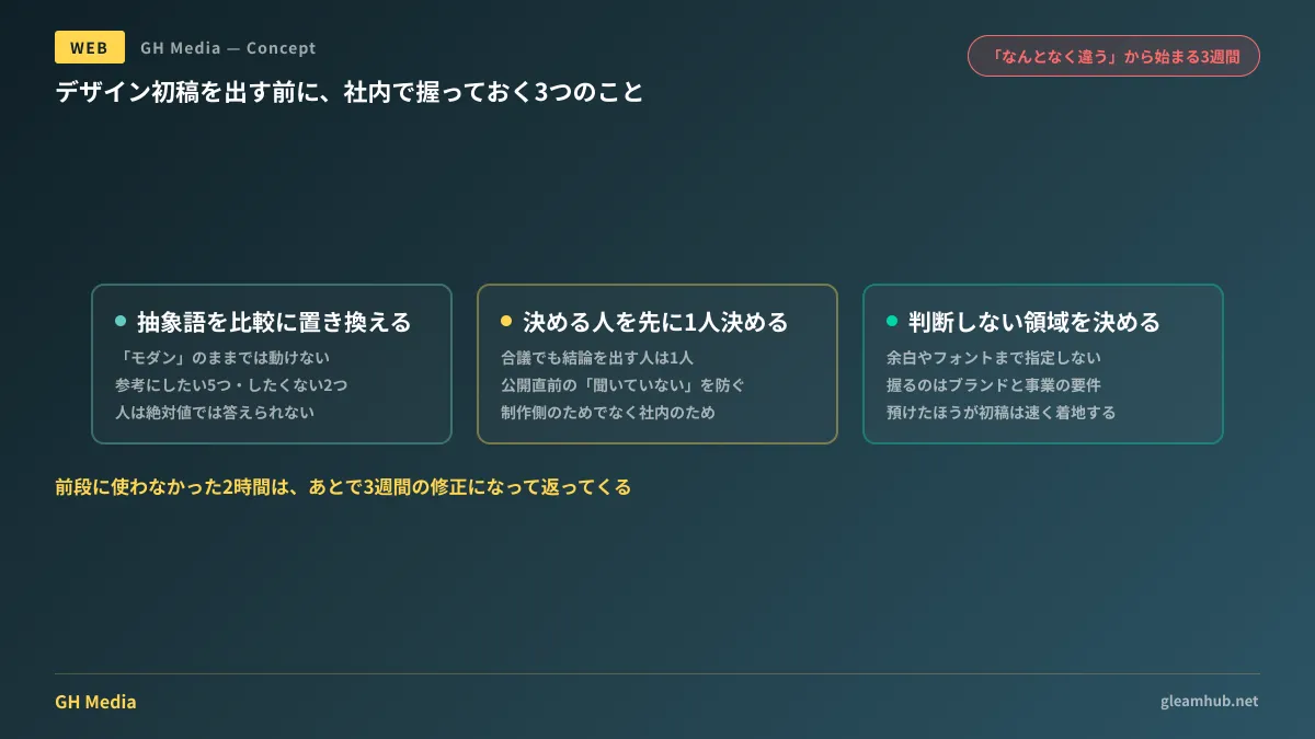
Translating this into practical steps for the client, there are three key things to lock down before the initial draft.
1. Ground abstract terms in comparisons
You cannot act on "modern" alone. But reframe it as: "Between Company A and Company B, which is closer?" or "What do you want to keep from our current site, and what do you want to discard?" Suddenly, people can make clear evaluations. People struggle with absolute descriptions, but they excel at comparisons.
List five competitor or reference sites, note whether each is "close" or "far," and provide a one-line reason for each. That alone gives clear shape to abstract buzzwords.
2. Designate a single decision-maker upfront
Either the decision-maker is absent from the initial review, or there are multiple decision-makers. That dynamic is what spawns endless revision loops. Specify clearly at kickoff whose call will ultimately decide the outcome. Even when deciding by committee, designate a single person to consolidate feedback and make the final call.
This is not just for the agency's benefit; it is for your own team. Projects run without a clear decision-maker inevitably lead to someone speaking up right before launch saying, "I never agreed to this."
3. Predefine areas you will not second-guess
Trying to scrutinize everything degrades the quality of your decisions. Clearly defining areas where you will defer to the designers helps the initial draft land much faster. When clients start dictating heading font sizes or precise whitespace rules, designers stop exercising judgment and shift into passive order-taking, pulling down overall quality.
What you should control are non-negotiable brand elements (corporate colors, logo usage, photographic tone, tone of voice) and non-negotiable business requirements (who the site is for and what action they should take). Leave everything else in the creators' hands.
Don't try to eliminate personal tastes
A common counterargument is, "Design is subjective, so doesn't it just come down to personal preference in the end?" That is half true. However, the sequence is backward.
Instead of eliminating personal tastes, determine upfront the boundaries where personal taste is allowed. That is the practical middle ground.
Lock down non-negotiable requirements based on business objectives first (such as keeping font sizes legible because the target demographic is 50+, or prioritizing metrics over imagery for a B2B audience). Within whatever options remain, let personal preference decide. Having this boundary makes it easy to determine whether "I don't like it" represents a requirement violation or simply subjective taste. If it violates a requirement, fix it. If it is personal preference, the designated decision-maker makes the call and moves forward.
In projects lacking this distinction, subjective opinions carry the same weight as core requirements, dragging revisions out indefinitely.
Importantly, this step does not mean adding countless pre-design meetings. A single two-hour session with key stakeholders is plenty. Failing to invest those two hours upfront will cost you three weeks of delays later.
How this reflects in choosing an agency
Everything discussed so far also serves as a lens for selecting an agency.
Does the agency prioritize this alignment before delivering the first draft? In their proposal, do they include a discovery and alignment phase prior to design, or do they immediately jump in with "we will start by presenting three design concepts"?
The latter approach is not inherently bad. If your brand is already firmly established and internal consensus is solid, that route is faster. However, in situations prone to that "it feels off" reaction—numerous stakeholders, busy decision-makers unable to attend ongoing sessions, or divided internal opinions—partnering with a firm that incorporates this upfront alignment will prove far less expensive in the end.
Upfront considerations regarding whether to build internally or outsource are discussed in No-Code DIY vs. Hiring an Agency, and our overall redesign roadmap is outlined in Corporate Website Redesign Guide. If you want to evaluate evaluation criteria for web development partners, see also our No-Code Website Builder Comparison.
Spend 30 minutes internally before kickoff
Before reaching out to external agencies, hold a 30-minute internal meeting. There is only one task:
Pick five sites you want to emulate and two you do not, writing a one-line reason for each. Involve at least three people. If opinions diverge here, you have simply surfaced early what would have fractured mid-project anyway—at a stage when resolving it is practically free.
It is completely fine to solicit proposals even if opinions remain divided. However, if that is the case, state upfront that "internal opinions are split." If you communicate that, the agency can structure the process accordingly. If you proceed without sharing that context, you will find yourself in that three-week revision spiral.
If you would like guidance on managing a website redesign from internal consensus building onward, GleamHub offers consultations for website production and redesigns. Because optimal approaches depend on specific project requirements, we provide customized quotes. Please get in touch via our contact form.
Sources
- From Kickoff To First Concept: How To Turn Brand Strategy Into Visual Direction — Smashing Magazine (July 2026)
- Thinking Outside The Box: Digital Design In The AI Era — Smashing Magazine (July 2026)
- Translating Brand Strategy into Visuals: The "Pre-Concept" Design Thinking Behind Great Identities — unprinted


