

When explaining new business workflows or permission structures internally, this is what often happens: writing it out takes three A4 pages and nobody reads it. Attempting to make diagrams fails because nobody who can build slides is free. Ultimately, it gets explained verbally with an unfulfilled promise that "materials will be shared later," and progress halts.
It is not that the quality of the explanation is poor. Rather, the subject being explained inherently has a structure that is difficult to represent in a single static image. Permission hierarchies, data flows, conditional branching—these types of concepts click instantly when viewers can manipulate them themselves.
Chat responses themselves can now move
Starting August 24, 2026, Google began rolling out a feature that generates interactive visual content as responses in the Gemini app. Instead of returning text and static images as before, it assembles content on the fly within the chat that users can rotate and zoom as an answer to questions.
The publicized example is a 3D structure of DNA that can be rotated and zoomed directly in the chat. The key takeaway is not its scientific subject matter, but the arrival of a new response format: "returning things that take long to explain verbally in an interactive format."
Previously, asking Gemini for a diagram returned an image or required switching to a separate file, such as Google Slides or a Google Sheets canvas. In other words, reviewing it required stepping outside the chat. Now, you can interact with it right where you asked.
They are only effective for things that "become too long in text"
When trying to use this feature in business operations, this is the first distinction to make: not every explanation benefits from a diagram.
In terms of internal operations, the following are well suited:
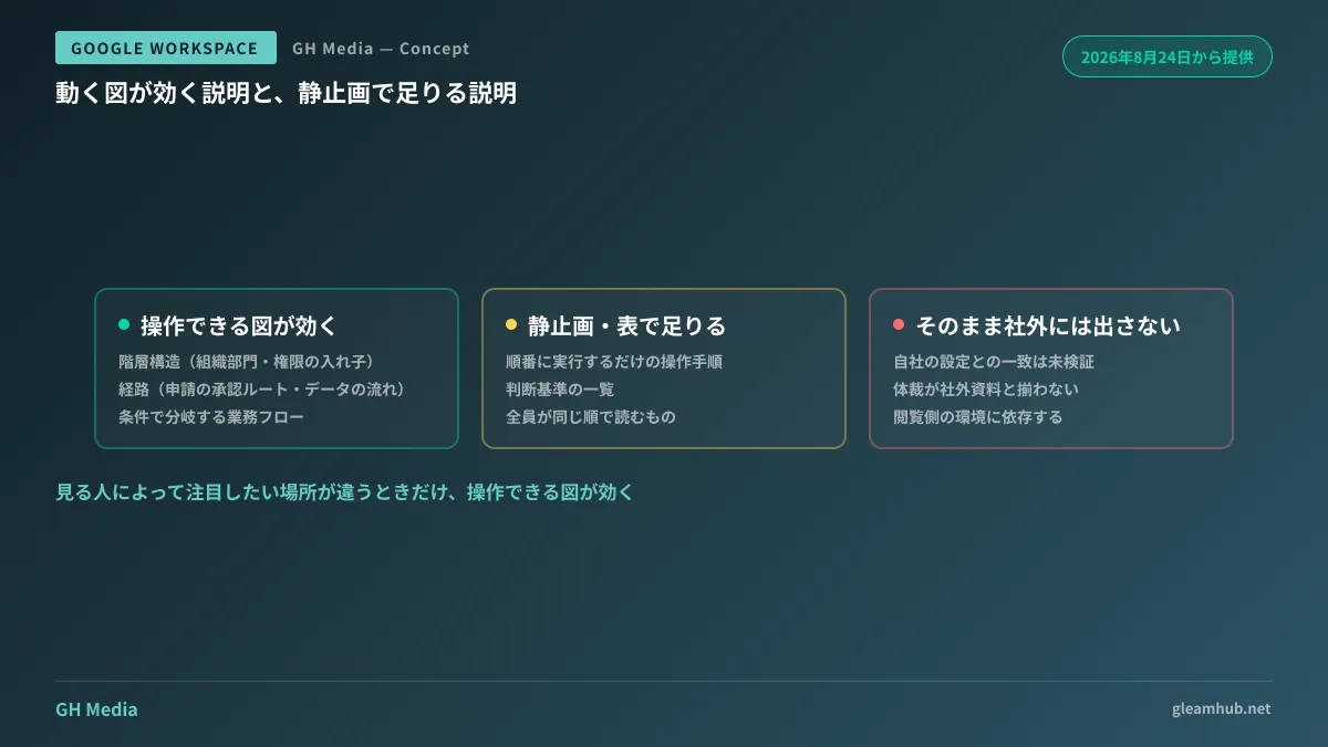
- Hierarchical structures (divisions and organizational units, nested permissions across shared drives and folders)
- Pathways (how an application flows to approval, which systems data traverses)
- Conditional variations (workflows with multiple instances of "take an alternate route only under this condition")
Conversely, sequential procedures (operating instructions that simply execute steps 1 through N) and lists of evaluation criteria are read faster as numbered lists or tables. The moment you turn them into an animated diagram, readers must figure out "where to click to ensure they have seen everything," which actually wastes time.
Diagrams improve clarity when different viewers want to focus on different areas. If everyone looks at the same things in the exact same order, a static image is plenty.
They cannot necessarily be shared externally as is
Even if sufficient for internal understanding, it is safer to assume that these outputs cannot be handed straight to business partners or clients as materials. There are three reasons.
First, the content has not been fact-checked. Even if a generated diagram works well as an explanation, there is no guarantee it matches your company's actual settings or operational realities. The more polished a diagram appears, the harder errors are to spot.
Second, the visual styling will not align with your company's materials. For externally facing collateral, visual consistency itself forms part of your credibility.
Third, it may not operate identically in the recipient's environment. Interactive content depends on the viewer's environment. If sharing externally, you will inevitably end up converting it to a static image or a PDF.
A practical approach is drawing a clear line: use them internally as drafts for comprehension, and have humans rebuild anything that goes external.
Only the person who requested it can verify its correctness
There is one more operational rule to decide: who verifies whether the generated diagram is correct.
The more intuitive an explanatory diagram is, the more readily it is believed. Anyone shown a permission hierarchy diagram will assume, "This must be how the system works." Even if a single arrow points the wrong direction, nobody will notice just by glancing at it.
Furthermore, the only person who can judge correctness is someone who knows the actual configuration. In most cases, that is the person who prompted the diagram. In other words, the moment the creator shares it without verification, an unvetted explanation begins circulating within the company.
The fix is simple: add a single-line note to any internally shared diagram stating what source and point in time it was based on. That alone allows recipients to recognize that "this is not verified documentation." As an operational rule, this is sufficient.
Three points administrators should review first
While the feature itself operates entirely on the user's end, administrators can avoid future panic by verifying the following three points in advance.
| What to verify | Why It Is Necessary |
|---|---|
| Who can use Gemini | License allocation status determines who has access and who does not |
| What is being input | Users easily fall into pasting operational data to turn it into diagrams |
| Where generated outputs are stored | Whether they persist as chat history or are saved as files |
The second point is particularly critical. The desire to "make an easy-to-understand diagram" inevitably drives users to make their inputs more detailed. If left unguided, people will inevitably paste permission tables or customer rosters directly with requests like "turn this into a diagram."
Rather than relying on cautionary warnings, establishing technical guardrails—such as restricting AI access through Drive labels and DLP—is far more reliable. Additionally, reviewing the Gemini usage dashboard to see who is using it and how much can be directly utilized to reassess license allocations.
What to do next
First, identify one topic in your company where "the explanation fails to get across." It can be a permission structure or an application flow. If it involves hierarchies or pathways, it makes an ideal first candidate for this feature. If it involves procedures, refining the written manual will be more effective than a diagram.
Next, verify whether the data used for that explanation is permissible to paste. The higher the value of diagramming a topic, the more it reflects internal company structures. If boundaries around what can be pasted are not yet established, defining those comes before using the feature.
GleamHub offers free IT and Google Workspace consultations covering Gemini usage scope design within Google Workspace, confidential data handling policies, and license allocation reviews. Because appropriate boundaries vary depending on organization size and the nature of handled data, please consult with us individually. Reach out via our contact page.


